
When someone mentions pivot tables, do you cringe? I used to — until I learned how simple they were to set up!
Example: The newly designed reports I run from EBSCO have multiple rows for each library. Worse yet, if I want a breakdown of the monthly (versus yearly) statistics for each library, I am looking at a spreadsheet with thousands and thousands of rows. Thankfully, pivot tables help summarize the data for me.
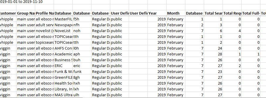
Getting started is easy.
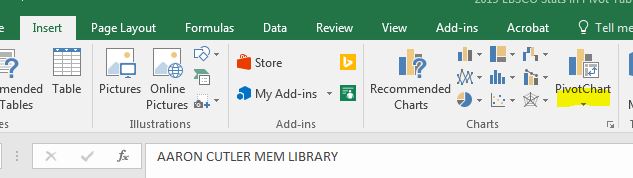
- Click anywhere within your spreadsheet and view the “Insert” tab.
- Now click on the icon for “PivotChart” and from the drop-down, select “PivotChart & PivotTable.
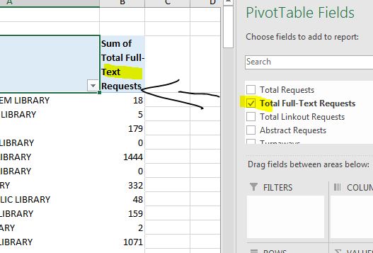
- To build the table, select the column headings from the right side of the page. Multiple rows with “exact” names are combined and the numbers are summed.
More complicated data sets are still summarized and become easily readable.
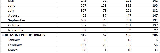
How easy was that?
The Simplicity of Pivot Tables