
In preparing for an upcoming talk on reaching patrons through their mobile devices, I’m taking a closer look at creating mobile friendly sites.
It turns out that if you are WordPress or Blogger user, creating a mobile site is simpler than ever!
Let’s start with Blogger.
Let’s say you already have a Blogger blog or you’re site-less and plan to create one. It’s couldn’t be easier to enable a mobile version of your site.
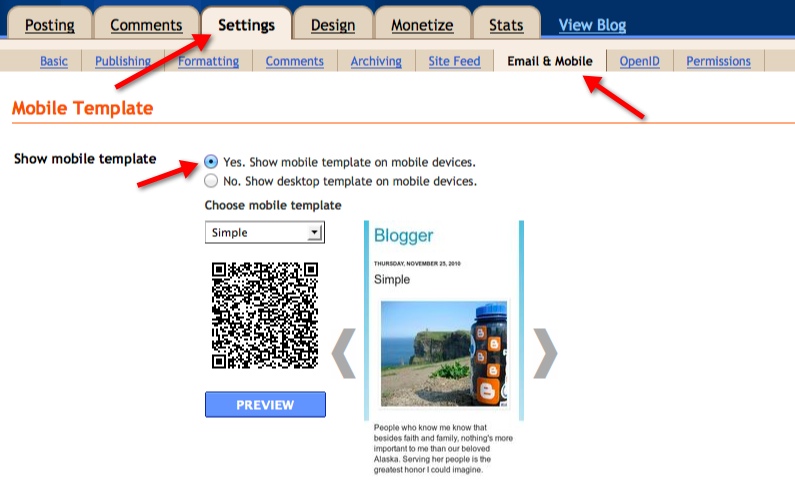
After logging into your Blogger dashboard, visit the site “Settings” and choose the “Email & Mobile” tab. Once there, decide which mobile template (or look) works best for your site. There’s only a few to choose from, but you see so little of the template on a mobile device that it’s not a huge issue. After selecting a template, save the settings.
(Click on any image to get a larger view.)
And here’s what the site looks like on a small iPod Touch screen:
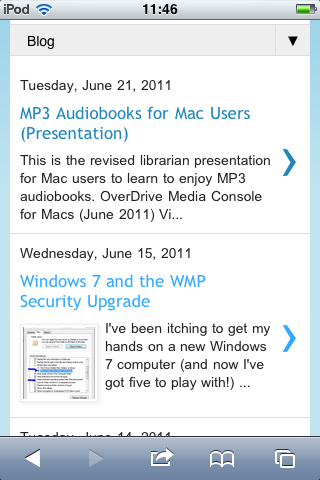
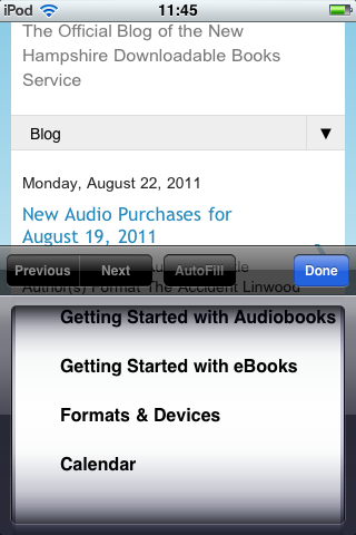
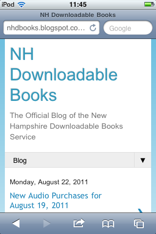
Pretty good! Note that the posts show up on the first page but the pages are selected from the little drop-down arrow next to “Blog.”
On to WordPress.com (in this case):
The mobile site is dependent upon the theme you use. For this situation I just used WordPress’ new theme Twenty Eleven to maximize mobile features. Using the Twenty Eleven theme there was nothing to do to get a nice mobile version of the site.
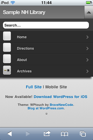
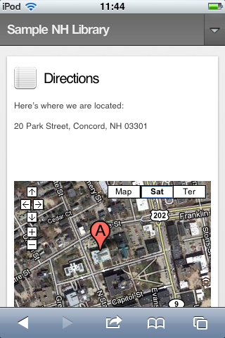
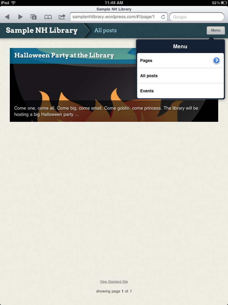
The theme had a funky option for iPad reading. It makes the WordPress site very “app-like” without having to do a thing (other than enable it). Check it out:

Here’s my advice: If you already use Blogger, enable the mobile site. (Done!) If you use WordPress.com or WordPress.org, check out how well your theme works on a smaller screen. If the WordPress.org site doesn’t render well on a mobile device, there are a few plugins that reformat the site. I’ve installed WP Mobile Detector to this site. The newest blog posts show up at the top and the pages are provided in a single column at the bottom of the page. It’s not the fanciest of designs, but it works well enough. (Although it definitely handles text better than images.)
And what if you use something else? Consider making a mobile version of your site with the basic stuff (Hours, directions, links, etc.) on a Blogger or WP site. There seems to be plenty of script available to detect a mobile device and redirect them to a mobile version of your site. Can anyone recommend something to easily manage that?
Thanks for the Blogger tip, done!
I’m not using it on ryepubliclibrary.org, but the mobile device detection script recommended by Brian Herzog at Chelmsford (MA) is posted on his website at
http://www.swissarmylibrarian.net/mobile/
Thanks, Sharon! There is *plenty* of stuff I didn’t address in my post and there are so many other directions to go. I was just looking for some quick solutions that would work well with the platforms already being used. 😉